Get KoolPHP UI with 30% OFF!

Chart renders correctly but grid markers are not working correctly

Timothy Graber
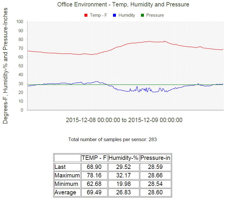
I have a line chart that displays temperature, humidity and barometric pressure. In one day, with samples every 5 minutes, there are a total of 288 data points per sensor. On the Y-Axis, I have Major and Minimum step values set to 10 and 5. This is working nicely.
Issue 1: I would like to make horizontal grid lines appear but with the settings below, I cannot seem to make them appear. If I zoom in really close to the graphic, I see white lines overlaying the vertical grid.
$chart->PlotArea->YAxis->MajorGridLines->Visible = true;
$chart->PlotArea->YAxis->MajorGridLines->Color = "black";
$chart->PlotArea->YAxis->MajorGridLines->Width = 1;
Issue 2: I would like to have vertical major and minor steps at 48 and 12 respectively. I can only see steps at every data point - on this graph - 288 of them. The properties I have set for these are
$chart->PlotArea->XAxis->MajorGridLines->Visible = true;
$chart->PlotArea->XAxis->MinorGridLines->Visible = false;
$chart->PlotArea->XAxis->MajorStep = 48;
$chart->PlotArea->XAxis->MinorStep = 12;
Not sure where I'm going wrong... thanks in advance
Posted Dec 9, 2015 Kool
Peter
Could you please post the image of the graph here. We would like to see.
Posted Dec 10, 2015 Kool
Timothy Graber

Here it is. If you zoom in, you will see a faint overlay in the plot area. Here is my chart rendering code settings. What I want to do is have black lines on the major/minor ticks of the y-axis and optionally, vertical lines every 12/48 ticks on the x-axis.
$chart->PlotArea->YAxis->MajorGridLines->Visible = true;
$chart->PlotArea->YAxis->MajorGridLines->Color = "black";
$chart->PlotArea->YAxis->MajorGridLines->Width = 1;
$series = new LineSeries();
$series->Name = "Temp - F";
$series->Appearance->BackgroundColor="red";
$series->TooltipsAppearance->DataFormatString = "{0}% {1}";
$series->LabelsAppearance->Visible = false;
$series->MarkersAppearance->Visible = false;
$series->ArrayData($_seriesF_items);
$chart->PlotArea->AddSeries($series);
$series = new LineSeries();
$series->Name = "Humidity";
$series->Appearance->BackgroundColor="blue";
$series->TooltipsAppearance->DataFormatString = "{0}% {1}";
$series->LabelsAppearance->Visible = false;
$series->MarkersAppearance->Visible = false;
$series->ArrayData($_seriesH_items);
$chart->PlotArea->AddSeries($series);
$series = new LineSeries();
$series->Name = "Pressure";
$series->Appearance->BackgroundColor="green";
$series->TooltipsAppearance->DataFormatString = "{0}% {1}";
$series->LabelsAppearance->Visible = false;
$series->MarkersAppearance->Visible = false;
$series->ArrayData($_seriesP_items);
$chart->PlotArea->AddSeries($series)
Posted Dec 10, 2015 Kool
David
Hi Timothy,
To solve the grid line problem, could you please also set the following values:
$chart->PlotArea->XAxis->MinValue = ...;
$chart->PlotArea->XAxis->MaxValue= ...;

and see how it runs. Thanks!
Posted Dec 11, 2015 , edited Dec 11, 2015 Kool
Timothy Graber
Hi David,
I put in the extra property values and still no change. The X-Axis still has a tick mark for every sample taken. I set the minimum value to 1 and the maximum value to the number of samples taken, so it varies based on the time frame selected in the calendar picker object. If you need more information about the query I am running or the actual data in the data sets returned, I can drop them into a spreadsheet - if that would be helpful.
Thanks,
Tim
Posted Dec 12, 2015 Kool
Segun
Need to make the YValue a variable and is not allowing me.
Could anybody help check this code below and suggest how I can achieve this
require "KoolControls/KoolChart/koolchart.php";
$pieChart = new KoolChart("pieChart");
$pieChart->scriptFolder="";
$pieChart->Height = 300;
$pieChart->Width = 350;
$pieChart->FontFamily = "Candara";
$pieChart->Title->Text = "Site Visit Distribution";
$pieChart->Title->Appearance->Align = "Left";
$pieChart->Legend->Appearance->Position = "Top";
$pieChart->PlotArea->YAxis->LabelsAppearance->DataFormatString = " {0}%";
$series = new PieSeries();
/*$item = new PieItem();
//$item->YValue = $totalVisitNG;
$item->YValue = 27;
$item->Name="Nigeria";
$item->BackgroundColor = "#999999";
$item->Exploded = true;
$series->AddItem($item);
$item = new PieItem();
//$item->YValue= $totalVisitUK;
$item->YValue= 15;
$item->Name="United Kingdom";
$item->BackgroundColor = "#666666";
$series->AddItem($item);
$item = new PieItem();
//$item->YValue= $totalVisitUS;
$item->YValue= 30;
$item->Name="United States";
$item->BackgroundColor = "#333333";
$series->AddItem($item);
$item = new PieItem();
//$item->YValue= $totalVisitOT;
$item->YValue= 10;
$item->Name="Others";
$item->BackgroundColor = "#333333";
$series->AddItem($item);*/
$series->AddItem(new PieItem(80,"Nigeria",'#006600',true));
$series->AddItem(new PieItem(30,"United Kingdom",'#CCAB00',false));
$series->AddItem(new PieItem(20,"United States",'#461C00',false));
$series->AddItem(new PieItem(10,"Others",'#003300',true));
$pieChart->PlotArea->AddSeries($series);
Posted Apr 14, 2016 Kool